Thursday, December 31, 2015

Typo Manipulation

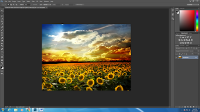
    Week 7 !!!! Time flies, this week we have learn something new and fun, which call Typography manipulation. And now, here is the steps that how i do mine.

1.Create a new layer and place a nice picture that you had choose.


2.Open a new layer , edit the fill to white adn 70% capacity.


3.Type a words.


4.Click blending option of the typing layer, change the knockout to SHALLOW, and turn down the capacity top 0%.


5.DONE!!!

final outcome


For the lecture class,Miss Nazirah ask us to went to the lab and try on importing vector graphic.


the result of our group


Friday, December 18, 2015

Retouching Image

   Lecture class has been cancel, but madam gave us work too. There's no lecture for today but we have been given a task to be done. We were told to edit a picture of ourselves in Photoshop. Pn.Nazirah asked us to edit something on our face, example like, removing skin blemishes, changing skin tone, whiten teeth and more.


comparison of my photo


   This is the tutorial that i had watched to learn:


smooth skin tutorial


Blusher and lips tutorial

Thursday, December 17, 2015

The final of assignment 1

    Here is the steps of how i did my assignment 1.Due to the reason of pendrive missing, so i would not have any picture of the steps.


1.Get a nice back ground.
2.Add a new layer and open picture of the character.
3.Use quick selection and refine edge to trim your character out.
4.Place it on the right place.
5.Open a new layer and trim your face with the same technique.
6.I had add some windmill to the background to make it looks more.

7.This is the result.


Saturday, December 12, 2015

Assignment 1

    In the lecture class, we learn about difference between traditional photography and digital photography. Traditional photography involves light reacting with silver halides on film to produce an image. Digital photography involves converting the various wavelengths of light into a code of 0's and 1's, which is then converted by a computer into an image. Traditional photography requires a chemical process to process the film and produce the image, while digital photography requires a computer and the right software to produce the image. Traditional photography produces clearer images that can be blown up with less image degradation, but digital photography is closing that gap. Traditional photographs discolor, fade, and degrade over time, but digital photographs can be preserved with their original image quality forever.


 The tutorial class of this week was a consultation session. We sketch our ideas and show madam. For me, i decided to do a CAT WOMEN.

Cat women

Thursday, December 3, 2015

Mind Map


    Madam asked us to do a mind map in group to understand about  JPEG,JPEG 2000, EXIF, TIFF ,BMP , RAW, GIF, PNG and more.


In the tutorial of this week, how to change low resolution photos to high resolution in Photoshop.

Tutorial that madam show from youtube


Result of mine
 The purpose of this work is to compare 4 view of the image with different type of file format like for example, GIF, JPEG,PNG-24 and others.


Thursday, November 26, 2015

WEEK 2

    The second week was here, we meet our lecturer that Madam Ling had told us last week. She told us that she was study here in MMU last time. After all introduction have done, she show us history about photoshop.


    During the tutorial class, we finally touch photoshop. Madam ling taught us how to combined two different photo into one.

This is the result


Homework of today: 

1.Using the same technique.


A girl snorkeling and a shark added into the picture.

2.Draw photoshop tool bar 


Monday, November 16, 2015

WEEK 1

    The first class of SEM 2 computer graphic, was taken by Madam Ling. At the first lecture,  Madam Ling briefed us about the course outline. this sem we will be touching a lot of adobe photoshop. I'm excited about that so much because i have heard about photoshop a lot but now is the chance to know deeper. 


Wednesday, September 16, 2015

TEXTURE 

  Actually we had learn this from the VRC class, so its more easier for me to catch up. But there is slightly different with the vrc because the texture in Computer graphic is you have to feel the texture with your eyes instead of your hand. Other than this there are almost the same. It give into 4 different kind of texture:


  1. Actual Texture 
  2. Invented Texture
  3. Abstract Texture
  4. Stimulated texture

  On the lecture class, we had went to the outside to find some texture and paste them on a hard paper place them into a composition creatively like what Picasso have done. 


This is how it looks like.

The next day, we been told to trace them into illustrator. 

The first trace


  It looks terrible...
After few days i found that madam had given us some tutorial link about how to create texture. And i try to log on those website, it really helps a lot !!!! Here is the link:


The Final


----------------END--------------


ASSIGNMENT 2 

  Finally the assignment 2 had briefed..
This time we had been required to design a creative poster by using INDESIGN, we have to apply different Typography and also put in part of our mural sketch into the poster.


This is the first sketch i have done. But during consult , madam said it is too boring and try to be creative.So i try to improve a little bit and this is my final poster design:


While doing this i had refer to many tips and tutorial. Here is some example:

               
[ Text around a circle tutorial ] 


[ Drop shadow ]


And finally the poster is credit to MYSELF !!!


Friday, August 28, 2015

TYPOGRAPHY

  In the typography lecture class I learn that typography have different types also, especially the Serif and San serif fonts. It really physically helps to manage the feeling of the reader while he/she are reading.


  • Colour


  • Size


  • Contrast


  • Font


  • Line & Spacing


 These picture are the examples that my group member and I had found from the magazine.


Thursday, August 20, 2015

GESTALT

  Gestalt is the new chapter we learn this week, i don't really understand what it is about so i do some research about it on wikipedia.Its also got different principles: 


  • Similarity 


  • Continuity 


  • Proximity


  • Figure and ground


  • Closure


Meanwhile, Madam divided our class into 5 group as usual to apply creativity on Gestalt principles

Figure and ground


Saturday, August 15, 2015

INDESIGN 

  Its a brand new week !!! This week we stepped into a new chapter, its about LAYOUT. We had learn how does a magazine, poster, brochure did the layout, how the layout could help reader to attention on certain part. The layouts separated into :


  • Wrap text 


  • Header


  • Footer


  • Caption 


  • Column: 

3 column


6 column


  • Gutter 


  • Dropcap


[ Images above create to Google ]


Monday, August 10, 2015

ASSIGNMENT  1 

 Finally there is assignment for us!!! The assignment is about BLENDED LEARNING. All we have to do is to draw a sketch on a A4 paper first. 


First Sketch

  After the sketch approved, we have to trace it on illustrator. It took me over one day to finish the tracing, I search from youtube to get to know some tips on doing the trace. 


Learn from youtuber


  I also try to download image from google to get the exact symbol of WIFI and trace it. This make life easier HAHAHA!!!


Tracing image


  This is the final with the wall I have took. The wall is took with a window, and Im thinking like transform the window to be like a phone screen. After improved the sketch was a little bit different with the first sketch.


The final Mural sketch 


Friday, August 7, 2015

COLOUR...


  Since Form 4 i knew that there are RGB and CMYK in the colour mode, but i did not know what are the different. Finally i got to know what are they in the lecture this week. CMYK represents the standard coloured inks that printers use to create CyanMagenta, Yellow, and Black
  RGB colour is used for digital communications, like television or websites and CMYK is used for stuff made for print, like brochures. After studied the lecture, we group to a small group again to create our own colour scheme. 

our own colour scheme 
  
  The next day in the tutorial class, madam want us to use the colour scheme that we had created yesterday and colour the shape that we had cut last week. 


Shape composition


This is the result


  In illustrator, I learn how to use grid to help us keep the composition balance. It really do help. While using pen tool , i feel like Im getting more familiar to it. I also learn how to use reflect tool in illustrator to reflect those same shape. 


Youtube (Lynda.com) 


Its very satisfied when you seeing your masterpiece come out. Really enjoy the feeling. ^^


Monday, July 13, 2015

LINE is not just a LINE


    Poem of our group

  Today Madam Ling taught us about a LINE. She want us to made a poem creatively about Lines and Dots. After the poem , we were be asked by madam to group a group again to draw a drawing with DOTS and form those dots into a creative composition.


An apple 

  After a long discussion, my group members and I thinking like simple is always the nicer one so we decide to draw dots to form an apple, But at last madam said this is not creative enough. T__T